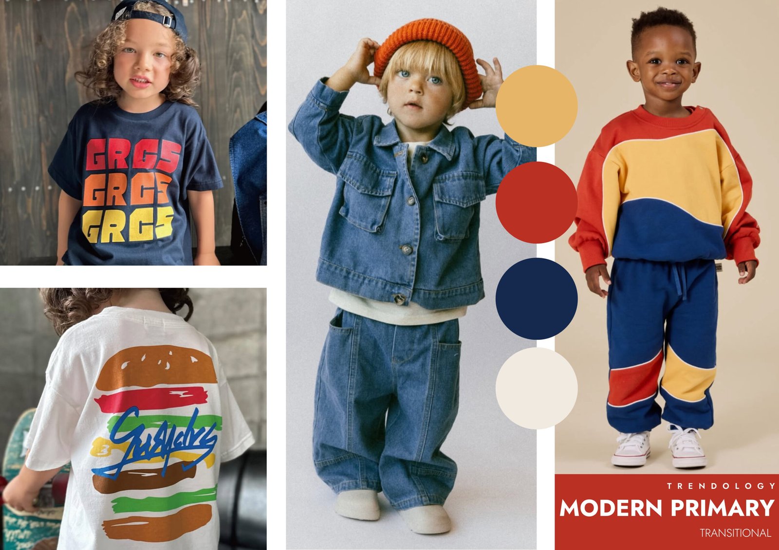
Primary colours have always been a cornerstone of kidswear – bold, playful and instantly recognisable. But for this transitional moment, Modern Primary reframes these familiar hues through a more considered, design-led lens. Rather than loud novelty colour, this story leans into clean colour blocking, softened saturation and everyday silhouettes, creating a look that feels confident, wearable and contemporary.
This is primary colour grown up. Reds, yellows and blues are grounded with denim, off-white and navy, allowing the palette to feel balanced rather than overpowering. The result is a direction that feels playful yet purposeful, rooted in nostalgia but clearly aligned with modern wardrobes.
The Colour Story – Bold, Familiar, Rebalanced
Modern Primary takes classic colour theory and updates it for real life.
• True red and softened rust tones bring warmth and energy without tipping into novelty
• Sun-washed yellow adds optimism, used strategically as a highlight rather than a base
• Deep cobalt and navy blues ground the palette, offering longevity and easy layering
• Off-white and ecru create breathing space, keeping looks fresh and versatile
• Mid-wash denim acts as a neutral anchor, reinforcing wearability across seasons
The palette is intentionally restrained, designed to feel impactful at first glance but easy to live with day to day.
Why It’s Resonating Now
A Return to Familiar Comfort
In uncertain times, parents gravitate towards colours they trust. Primary hues feel reassuring and timeless, while this updated execution keeps them from feeling dated.
Nostalgia, Refined
Modern Primary taps into retro sportswear, playground graphics and vintage tees, but filters them through cleaner lines and more thoughtful colour placement.
Transitional Versatility
This story works seamlessly between seasons. Layer-friendly tones and relaxed shapes make it ideal for in-between dressing, from late summer into early autumn.
Gender-Neutral Appeal
By focusing on balance rather than brightness, Modern Primary offers a confident, inclusive colour story that works across genders and age groups.
Design Applications to Explore
Graphic Tees & Sweatshirts
Bold placement prints, stacked typography and simple motifs allow colour to take centre stage without excessive decoration.
Colour-Blocked Sets
Sweatshirt-and-jogger combos feel modern when colour blocking is intentional and proportions are well considered.
Denim Foundations
Jackets, wide-leg jeans and co-ord sets in mid-wash denim provide a neutral base that supports stronger colour accents.
Easy Layers
Overshirts, lightweight jackets and sweat tops allow primaries to be introduced gradually through styling rather than full looks.
How to Make It Feel New
• Use fewer colours per outfit, focusing on strong pairings rather than full-spectrum brights
• Balance primary tones with denim, navy and off-white to avoid visual overload
• Keep silhouettes relaxed and slightly oversized for a contemporary feel
• Let colour do the talking – minimise trims, washes and surface effects
• Reference retro sportswear and vintage graphics, but with cleaner execution
Trend Takeaway
Modern Primary proves that bold colour doesn’t need to feel childish or chaotic. By refining classic hues through thoughtful placement, neutral grounding and relaxed silhouettes, this direction offers brands a commercially safe yet visually strong route for transitional collections.
For kidswear, it delivers the best of both worlds: recognisable colour that parents trust, paired with modern styling that feels current and confident. Modern Primary is not about reinventing the wheel – it’s about making timeless colour feel right for now.
Image Credits: @goldieandace, @fosteredcollection, @groovy_colors_official